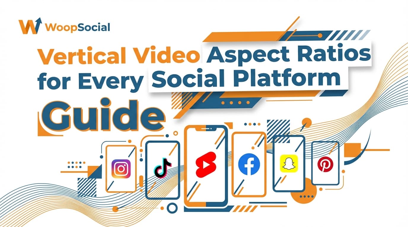
Vertical Video Aspect Ratios for Every Social Platform Guide
Learn the optimal vertical video aspect ratios for TikTok, Instagram, YouTube, and more. Shoot once, edit once, and publish everywhere without cropping.
Vertical video aspect ratios for every platform
Vertical video is the new standard, however, if you have ever published the same video to TikTok, Instagram, YouTube, Facebook, and Pinterest, you will know what I’m talking about: it goes live, but it gets cropped for feed preview, obscured by buttons, or truncates your title at the worst possible moment.
That is why Vertical video aspect ratios for every platform is not simply a matter of selecting 9:16 and moving on with your life.
You need to consider where your video will be consumed: full-screen canvases, in-feed grids, story ad slots, and paid media, each with varying aspect ratios, preview proportions, and UI elements that commandeer space. In this post, I’m going to give you actionable Vertical video aspect ratios for every platform so that you can shoot once, edit once, and publish everywhere without having to crop out key visuals, subtitles or calls to action.
I’m going to give you actionable, placement-level guidance (rather than generalised platform averages) as well as a simple workflow for deciding on a master aspect ratio, protecting safe zones and exporting video that looks ‘native’ wherever it ends up, whether that’s a feed, full-screen or ad. Here are the vertical video aspect ratios for each platform:
If you want a repeatable workflow for planning your publishing cadence around these formats, see social media content calendar.
The aspect ratios that are useful to you (and when to use them)
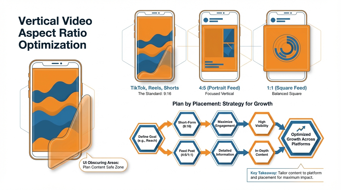
Vertical video aspect ratios for all platforms basically boil down to 9:16, 4:5, 1:1, and sometimes 3:4 or 2:3.
9:16 is your safe bet as your master since that’s what a full-screen experience like TikTok, Reels, Shorts, Stories, Spotlight, and most vertical ad formats are (1080×1920).
It’s also what you would use if you want to get the absolute maximum watch time for your video and every pixel is important.
That said, don’t let the core action of your video be at the very top and bottom as that’s where most platforms place their UI elements and subtitles. When you care about feeds, the 4:5 is king.
In scrolling feeds, 4:5 gives you more vertical space than 1:1 but isn’t invasive like full screen, so it’s a better thumb-stop for product demonstrations, before-and-afters, talking head promotions, etc.
4:5 is the go-to aspect ratio for feed-based content because platforms will display taller content in feed, but without blocking the viewer from watching even if it gets letterboxed.
I lean on 4:5 if I know the first view will be in a feed preview and if I don’t want to risk having my hook clipped off by the top or my points of evidence hidden below UI chrome.
The reason for 1:1? Bad things happen to vertical shots in profile grids and multi-platform edits.
Square is a better choice if you want thumbnail coherence, a clean grid presence, and predictability on thumbnails and previews, particularly for evergreen content that will remain on your grid as a storefront for your business.
1:1 is a good choice when your grid itself serves as a sales funnel, like a small business where your top posts are akin to a miniature catalog.
The crop is more stable and the framing is easier to balance on different devices.
And if you are editing a vertical post for multiple destinations, a square cut can be a more efficient way to rescue a frame where your subject is too tight to the edges in 9:16.
3:4 and 2:3 are the secret ratios that get you out of a tight spot when you still want a vertical frame but require a little more headroom for text, labels, or content.
They come in handy when a platform supports vertical video but shows it in-feed at a less exaggerated height, or when your 9:16 version starts to feel a bit claustrophobic and begins to slice off fingers, gadgets, or whatever else you’re working with on screen.
The important thing to realize here is that while 9:16 is a great standard for vertical production, it’s not a hard-and-fast rule for distribution because the way your content is framed for feed and grid presentation almost always dictates what users see before they press play.
You need to choose your ratio based on where your video will first be evaluated, such as full screen, feed preview, or grid display, and then export it that way to protect your hook and value prop from the crop.
If you want help building the content that goes into these formats, use an AI social media content generator.
Vertical video aspect ratios by platform, by placement (not just by app)
You need vertical video aspect ratios for all platforms to work if you’re going to plan by placement, because placement determines how your video will be previewed, cropped, and overlaid.
On Instagram, for example, Reels and Stories are built for 9:16 full screen (export at 1080×1920), but Feed video can be 9:16 too, except it’s initially previewed as an in-feed preview where 4:5 (1080×1350) reliably gives you more screen real estate without odd cropping.
I think of Instagram Feed as a separate product from Reels: Feed is about the thumb-stop in a crowded feed, Reels is about full-screen retention once you’ve gotten attention, and Stories is about tap-forward speed where any copy near the top or bottom gets muscled out by UI. If you want to systematize that workflow, read smart social media automation for.
The same thing happens on Facebook, just with more destinations: Reels is 9:16, Stories is 9:16, but Feed will squeeze or misframe your nice 9:16 project if you don’t also build a version that can get through a feed preview unmangled.
The best move for a SMB is to determine where the video will first be consumed: if it’s Reels or Stories, master in 9:16; if it’s Feed, create a 4:5 version for the feed-first video, but retain a 9:16 for Reels.
The time saving insight is what’s compatible vs. what looks good: a lot of feed units will take 9:16 video, but that feed preview crop is what determines if someone even presses play.
The easiest to ship is TikTok, but even that has a trap: the For You feed is 9:16 but your profile grid and preview tiles are the place where framing goes to die if your subject is pinned to the edges.
YouTube is the one that most teams fuck up: Shorts are 9:16 (1080×1920) but a vertical standard upload isn’t necessarily treated as a Short, which affects where it appears and how it’s previewed; you can have a vertical video that uploads just fine but looks like a compromised regular video in many places that matter.
My one rule here is that if the content is intended to function as Shorts then you frame and export as Shorts, and you keep the action centered so that even if it gets preview-cropped you still have a clean readable subject.
Snapchat Spotlight and Stories are both 9:16 full-screen, but on Pinterest is where the situational awareness needs to shine through: Idea-style verticals do best in 9:16, but the regular Pin can get best served by 2:3 as it fills more of the Pinterest feed without the urge of a full-screen takeover. Pinterest recommends vertical video aspect ratios including 2:3, 4:5, or 9:16, with video ads up to 2 GB and 4 seconds to 15 minutes long, and a recommended 6-15 seconds for video ads-see Pinterest’s product specs guidance in this Pinterest Business help doc.
LinkedIn vertical in-feed is an option, but it’s a feed-first platform so you’ll want to plan for the fact your video will likely get judged in a preview and have the hook higher and more centered than you would for a TikTok. LinkedIn also supports vertical like 9:16 with a 360×640 px to 1080×1920 px resolution range, plus up to 500 MB and 3 seconds to 30 minutes duration in its specs-see this LinkedIn video ad specs page.
X vertical video sits in-timeline, but the UI, captions, and changing device sizes make it dangerous to go edge-to-edge, so you win by having your key visual in the center “safe” column.
And don’t sleep on the edge cases that suddenly crop up late in the day: any messaging app status and stories-style variants are likely 9:16, but are even more unforgiving than TikTok for centering your text, so you center your core visual, and avoid extremes, and you produce a version that will display well, not just upload well.
If you want a bigger system for publishing consistently across placements, see social media auto publishing.
A list of vertical video aspect ratios across platforms, including safe zones, watermark and graphics overlays, and preview clipping that can butcher an otherwise perfect edit
The most important real-world “missing” Vertical video aspect ratios is not a ratio, but what will be obscured when you export.
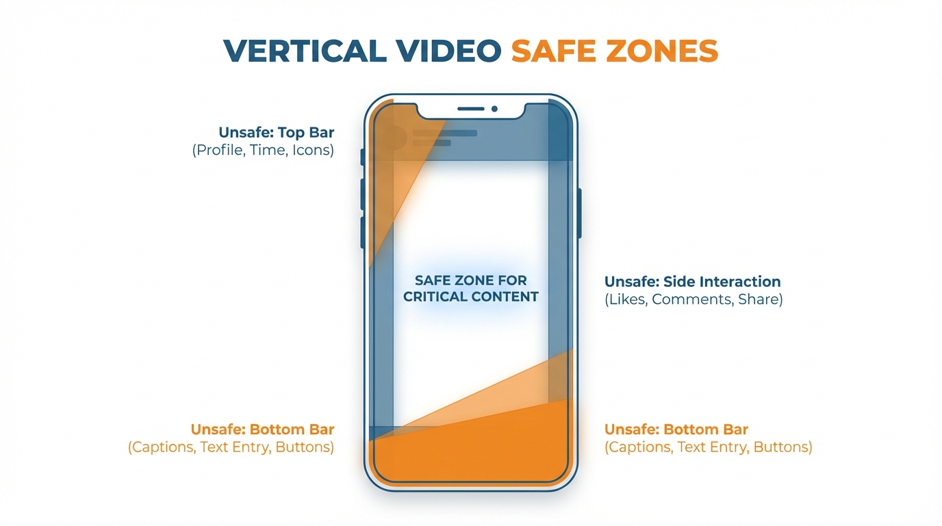
Each platform puts the UI in logical places:
- a bottom bar for text overlays, replies, and calls-to-action
- a right sidebar for “heart”, “share”, and user follow buttons
- a top bar for user handles, audio toggle, and “back” button
If you compose like a pro and put important elements against the frame edge, you’re basically asking for that content to get covered by chrome.
The hack is to think of your 9:16 frame as a bullseye: always put people, objects, and whatever is “doing the thing” dead center, and assume that you’re going to lose the bottom fifth of the screen in a lot of full-screen contexts.
First, center-weighted is better than edge-to-edge for reuse, because the harshest crop isn’t square.
Previews clip off the top and bottom of vertical videos, profile grids clip even more of them, and share cards can crop as they want.
I compensate for this with a center-weighted strategy, designing each frame to have a key element in the middle that I design the outside of the frame to augment, but not compete with.
For hands, product closeups, and demo screens, you should shoot and edit with a bit more space than you need because a 9:16 frame that looks great expanded may not include the core proofpoint in a 4:5 preview or square tile.
This is where text can really screw a small business.
Anytime text crashes with auto-captions or buttons, you lose the hook.
Leave the bottom third for platform captions and your subtitles, and keep your headline or offer above where you think it should go.
I aim for the middle third of the image, where text will avoid both interface elements and an overzealous preview trim.
I do a quick mental test of this before exporting an edit: if I can see a username at the top, a caption box at the bottom, and call-to-action buttons on the right, and my text still looks good, I’m golden.
If not, I don’t reword my text, I reposition it, because in most cases, the issue is the placement, not the text itself.
Cut for the tightest possible preview thumbnail because you can’t control whether viewers see your thumbnail or the first second of your video.
Your video will be viewed in a mini preview window and then again as a preview image that could be truncated top or bottom.
Your hook needs to be visual, not textual, and if you do use text, the font should be large enough to be readable in a small preview and placed in the middle of the video so that it isn’t truncated either way.
This will keep your edits from getting confusing if you post the same video on all of your platforms.
Snapchat formats also commonly require 9:16 with 720×1280 resolution and 3-180 seconds length depending on format, as described in this Snapchat ad formats and specs overview. And ‘Chat is the most used tab on Snapchat’ with 85% of Snapchatters using it regularly, with Sponsored Snaps that get opened driving 2× higher conversions per full-screen ad view-see this Snapchat Sponsored Snaps page.
One-master vertical video ratios for every platform (plus when to ditch it for performance and ads)
To achieve scale without editing each ad from scratch, choose a master format and make it a SOP.
The master for most small businesses will be 9:16, because that is the native ratio for full-screen experiences and it also delivers a clean export at 1080×1920.
If you’re feed-dominant, though - meaning that the majority of your views are on content that shows up first as a scroll-stop in Instagram or Facebook Feed - you may find that a 4:5-first master outperforms a 9:16 master because a 4:5 layout occupies more vertical space in the feed while retaining your hook in the preview.
My rule of thumb here is simple: if the first view happens full screen, you master 9:16; if the first view happens in feed, you master 4:5 and create a 9:16 for Reels, Shorts, and Stories.
I’ve seen 4:5 variants win in feed-led campaigns because the offer and proof both display above the fold, while the 9:16 version loses that offer to preview cropping and UI.
For export, you can run either a master file workflow or platform-specific renders.
This is a volume and crop-depends-on-message type call.
If you are running the same creative across a ton of platforms with minor crop adjustments, export a master and generate crops to keep consistency and speed.
If you are running multiple hooks, multiple languages, or you know each platform performs uniquely, do platform-specific exports so you can shift text around, resize subtitles, and ensure you preserve the first second for each platform.
Realistically, you should switch to platform-specific exports the moment your message relies on text positioning on screen or a product detail towards the edge, because that is where a master export will silently hemorrhage performance even though the video will technically upload to each platform.
My crop rules for going from 9:16 to 4:5 or 1:1 are simple and brutal: you save the subject, then the proof, then the hook, and everything else is a compromise.
Going from 9:16 to 4:5 means cutting off the top and bottom, so you want faces, hands, and product in the middle band and try to avoid having price, offer, or your main label near the bottom.
Going to 1:1 means an even tighter crop, so you want your essential action in a middle column that works as a still thumbnail.
To guarantee this works, film with headroom and side-room, and edit as though the outer 15-20% of your image may be cropped off in some version; I regard that border as embellishment, not content.
The list for organic vs paid is different because paid is subject to targeting specs and what an ad product can and cannot display, whereas when it comes to organic it’s a question of what appears visually in the editor.
Paid is what an ad spec allows and auto crops and letterboxes and letterboxing can shrink a video that was designed full frame and result in a completely unreadable ad.
That’s why I make the distinction between recommended and supported aspect ratios: recommended ratios are ratios that appear native and tend to perform well, supported ratios will not get rejected but will display with black bars and/or an awkward crop.
If you’re running paid, you need to be prepared to shift to a multi-export workflow and export different aspect ratios if that’s what a given ad spec calls for because paying for views on a shrunken letterboxed ad is a great way to spend a lot of money as a small business and get absolutely nowhere because you’re convinced it’s an issue of targeting.
If you want to automate the repeatable parts of this SOP, see social media calendar automation.
Vertical video formats on every platform to expand reach, not processes
It doesn’t have to be a scary thing, the different ratios on every platform.
But, it is if you think of every export as a completely new edit.
Decide on a master ratio that you can justify (99.9% of the time 9:16), and consider everything else just a crop, not a new edit.
Once you settle on a master ratio, you’re not stressing about the “optimal” ratio for each platform, you’re just doing the same thing every time: one shoot, one edit, and a few exports that look great.
It’s not about memorizing the specs, it’s about understanding how the platform is going to display your content.
Sure, it’ll be displayed in whatever format you provide, but what you get bonus points for is what appears in the feed preview, the grid square, the full screen viewer, or when an algorithm crops your image into a letterbox for an ad slot.
If you understand where it’s going to be seen first, you’ll avoid silent assassins like cutting off the hook of your video in a 4:5 feed preview, or putting your value proposition where the buttons and text may overlap.
This is why you have a safe zone.
This is why you want your subject, product, and proof to sit in the middle area so that you can go from 9:16 to 4:5 to 1:1 and not cut off any of the selling points.
Everything outside the safe zone I consider to be just embellishments because on most media you’re going to lose a chunk of that frame to the UI, the preview, and just variations in how different devices render the image, but you can predict that if you just design around it from the outset.
Done right, vertical isn’t an editing fee you pay to be vertical, it’s a distribution multiplier on your small business: You create once, and your content remains easy to read, easy to click, and on-brand whether it’s distributed as a Reel, a Story, a Short, a feed preview, or an ad.
The goal isn’t to memorize every spec, it’s to develop a pipeline that allows you to publish on all of them without your content feeling like it wasn’t meant for each.
Google’s Veo 3 can now generate vertical AI videos, adding support for vertical 9:16 aspect ratio video generation, and it reportedly reduced cost per second from $0.75 to $0.40 (and Veo 3 Fast from $0.40 to $0.15), as covered in this report on Veo 3 vertical 9:16 support.
Related reads
3/7/2026
TikTok to Reels Crossposting Workflow 2026: The Ultimate Guide
Learn the 2026 TikTok to Reels crossposting workflow. Optimize for speed, views, and Instagram-native quality to beat algorithms & grow.
3/2/2026
Threads for business: How to get started in 2026
Discover how small businesses can leverage Threads in 2026 for conversation-led growth. Learn to test offers, build a routine, and convert attention to action within the Meta ecosystem.
2/21/2026
How to Market a Law Firm on LinkedIn
Market your law firm effectively on LinkedIn. Learn a system that leverages individual lawyer profiles to build trust, relationships, and attract ideal clients.