How to Make Professional Posts Without a Designer
Unlock the secret to professional social media posts without needing a designer. This post shares a repeatable system for clean, consistent, and credible content, even for busy small business owners.

How to Make Professional Posts Without a Designer
If you are trying to decide how to make professional posts without a designer, this is the mindset shift that will make all the difference to you: professional is not a look, it is a repeatable system. When you don’t have a designer on staff, your task is not to suddenly become one. Your task is to create a simple process that you can repeat every time so that your posts come out clean, consistent and credible in-feed even when you are busy running a small business.
Most resources don’t go beyond “use Canva” and “use two fonts”. That’s not nearly enough to avoid the true telltale signs of an amateur: wonky spacing, pixelated exports, walls of text, random colors, and a different layout every post.
You can’t wing it. You need a system that makes good choices for you, before you even open a design tool.
In this post I’ll share the step-by-step system I use to take a concept and publish a blog post without using design talent. You’ll learn how to create a handful of repeatable templates, how to use the basic principles of visual hierarchy to make your blog posts scannable, and how to perform a simple quality assurance check to ensure each post you produce looks professional and on brand (even when you do it yourself).
Figure out what “professional” looks like on your brand and platform (technology tools notwithstanding)
It’s not about pretty or ugly.
Before you even get into design, give each post a job: authority, lead gen, announcement, community, or hiring.
The visual choices will follow: authority requires clarity and organization, lead gen requires an easy next step, announcements require instant understanding, community requires warmth and acknowledgement, hiring requires credibility and details.
The brands that fail design in reverse, deciding what it should look like before what it should do; the brands that succeed define what they want the result to be, then design for it.
One more thing: one-message-per-image.
The feed is a flash medium, and most people are scanning on their phones in an F-shape, capturing a headline, a stat or a few words before they stop.
If your image conveys three messages, that looks like spam, and it’s skipped.
You will want to add context, caveats and more value, but that’s what makes it look amateur.
When I need to add depth, I break up the message across a short carousel or an explainer format document, so each frame offers one key takeaway, and the slide-stacking does the lifting. If you want more structure for planning posts ahead of time, a social media content calendar helps make this repeatable.
Finally, describe what professional means to the specific platforms you’re designing for, not to some hypothetical concept of “good.”
Choose one or two platforms to design for first and describe what professional looks like on those platforms.
On LinkedIn, professional might mean clean typography, clear information hierarchy, and a defined structure, because users consume content quickly and value clarity. If you’re building around that, a LinkedIn content strategy can make the “job” of each post easier to define.
On Instagram, professional might mean consistently styled and paced content that performs well on a grid: templates and color systems that help a viewer recognize your content.
If you try to design for every platform at once, your content will feel like a midpoint between different platforms, and that will be off-brand for each of them.
Start by designing for the platforms where you want your content to feel native.
Last but not least, have a quality floor that you always meet: font size to read on 6-inch, logic to the layout, logic to color, contrast, and spacing.
A good rule of thumb is that if you cannot read that primary text on a 6-inch screen, you’re not professional, and if your spacing changes every day even when the content is awesome, you’re flaky.
Define 3 to 5 formats you will keep to such as a single image insight, a carousel/doc explain, quote or clip highlight, and announcement, so that you don’t have to design every week.
This is another place where tools like WoopSocial help you maintain consistency at scale by applying your brand voice to text and your logo and color automatically, but the key is your own definition of professional because that’s what keeps you from having random one-offs even if you move fast. This matches what creators report at scale: in the Adobe Creators’ Toolkit survey recap, 86% of global creators reported actively using creative generative AI, and 81% said it helps them create content they otherwise couldn't have made.
Create a little design system that you actually follow (fonts, type scale, spacing, layout recipes)
To learn how to design like a pro (no designer required), your first step is to apply constraints that make it difficult to fail.
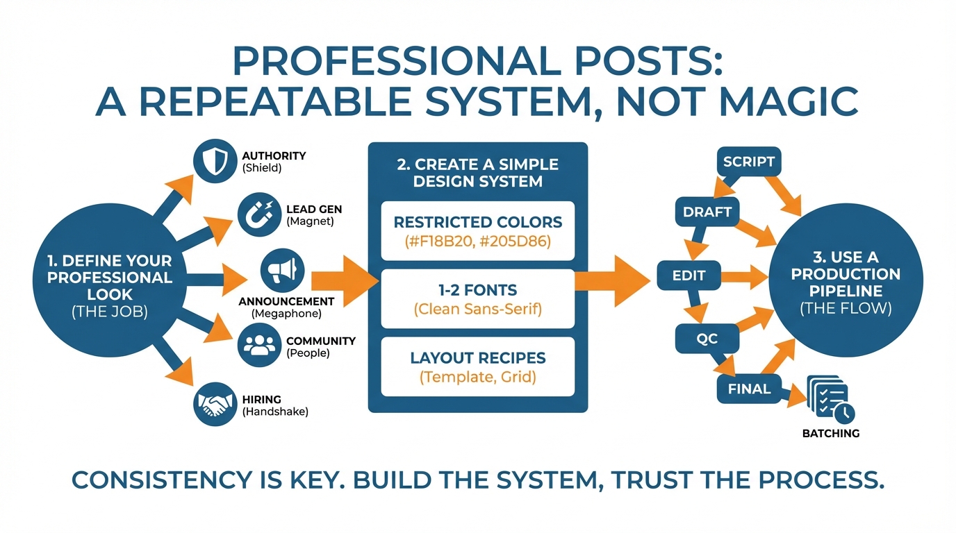
Use a restricted color palette (one core color, one secondary color, and then neutral tones), apply only 1 to 2 fonts, and establish a style where a headline is always a headline and body copy never vies for attention.
When I review the feeds of small businesses, the issue that kills credibility the most is not a lack of inspiration, it’s a lack of coherence: our brains interpret that as disorganization, and disorganization registers as distrustful.
Constraints overcome that problem immediately by eliminating decision paralysis and enabling repetition (branding is just that). This demonstrates the importance of web design in building trust and recognition with your audience. This also lines up with how people are working now: an Associated Press report on AI-enabled software found 98% of small businesses surveyed said they are utilizing a tool that is enabled by AI.
Then, create a functional typographic scale for social, and treat it as law, not a guideline.
Lock in 4 type sizes that you’re going to use every time: headline, subhead, body, micro-text.
From a technical perspective, a safe starting point for a 6-inch screen is a headline at 44 to 64px, a subhead at 26 to 34px, a body at 18 to 22px, and a micro-text at 14 to 16px, and then test that by placing your phone at arm’s length.
Do this every time, and you will be creating hierarchy, which is what makes a post look “designed.”
I do this very thing because it means every post is a fill-in-the-blank exercise, not a design exercise.
Next, address spacing, as this is a major amateur tell.
Use a single unit and derive all spacing from that unit: 8px is a good unit because it divides well from large to small.
Define a standard minimum margin (e.g. 48px, 72px from canvas boundary depending on the size), left align text, and fix vertical spacing (e.g. header to subheader is 16px, subheader to body is 24px).
A basic grid philosophy improves things rapidly: fewer left margins, more whitespace, and regularized vertical rhythm.
If you take one thing away from this, do this.
The use of a single spacing unit can improve quite average looking designs.
Last, pick a small set of layout recipes that will handle 80 percent of your content, and mix in a few brand ingredients that you use infrequently but consistently.
Use simple combinations like headline + sub-line + CTA, stat + key insight, 3 bullets + summary, before-and-after, problem-and-solution, etc.
Establish simple rules for logo use, so it still feels like your brand but isn’t screaming “advert” (e.g. always bottom-right, always same size, never overlap headline, etc).
Embed accessibility into your system as well, to help ensure you are able to maintain an elevated look & feel for your content: no thin fonts, minimum font sizes, quick contrast tests, etc.
If you need to ramp up the consistency in lots of posts, use a tool like WoopSocial to automatically apply your logo, colors and brand voice, so you can preserve your system even at high speeds.
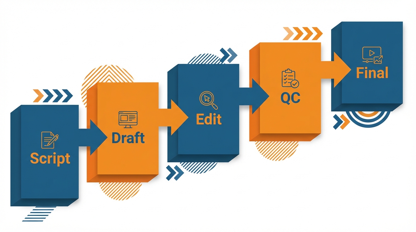
Use a production pipeline that delivers: script → draft → edit → QC → final
(and batch it)
Want to know how to design professional looking posts without a designer?
Start treating a post like production, not a tiny art project.
Get a 60-second creative brief before you begin: who is it for? What do you want them to remember? What do you want them to do? What is the very first thing you want them to read?
The first line is your anchor because a lot of people decide within two seconds whether they will stop scrolling.
And on mobile they will only see a headline and a few words.
Once you can express your post in a single sentence the design gets WAY easier because you no longer have to squeeze context, nuance, and credibility in one frame. If you want a more repeatable workflow, a weekly social media system can make batching feel less chaotic.
Second, write your copy first and design for comprehension rather than embellishment.
If you’ve written in a block of copy you should be able to select it and see the order of information that should be presented: headline, subhead, proof, then small call to action.
I write the headline and the subhead and then cut 30-50% of the copy before I even design because too many words is the quickest way to look like an amateur in feed.
Once your copy flows you can then design around that with the rest of your rules that you’ve established, the locked font sizes, the consistent margins, the consistent spacing units.
That’s the difference between a post that looks designed and a post that looks like you struggled to fit into a template.
And then intentionally turn one concept into 3+ different formats, without duplication.
You’re going to take one insight and make a hook out of it, a carousel/document with the same message but spread out on multiple slides, and a story/reel cover with the same headline on it.
And all of those will have the same design framework, so the viewer still recognizes you, no matter the format.
If you use WoopSocial to generate the concepts and to auto-apply the logo, colors, and the brand tone of voice, then you can focus on the brief and the structure, while the rest of the branding is taken care of.
Always do a quick QA checklist before exporting: everything aligned, spacing consistent, font consistent, contrast, crop, safe zones, phone view at arm’s length.
Most cheap-looking posts failed at export, not design: blur is either from scaling after export or exporting the wrong file type.
Compression artifacts are from exporting too small and the platforms having to scale it.
Export to the platform’s native size, never rescreenshot, and have a naming convention (e.g. Platform_Format_Topic_Date) so you can immediately export and reuse what already worked.
And always batch your production weekly: professional brands look professional primarily because they follow a consistent pattern, and batching is how you achieve that as a small business without spending time each day on it.
Effortless professional scale: systems, automation, and minimalist branding
Want to learn how to write professional posts without a designer?
Start by not approaching each post as a new design challenge.
The reason you get efficiency is by developing a handful of core formats and using them on repeat.
Formats are just vessels for content: image and insight, stat and conclusion, simple how-to frameworks, before-and-after, myth-reality, a short stack where each slide is a single thought, and so on.
By keeping the vessel consistent, you use your mental and creative energy on the content, and you signal to your audience that you’re dependable.
And it’s that dependability that does more to create a perception of professionalism than beautiful design. In fact, the Axios breakdown of small-business AI adoption noted 68% of genAI-using small business owners said they're spending less than $50/month for AI services, which makes systems and repeatability even more important than expensive polish.
To keep this feasible, structure a light pipeline that ensures design never holds up a post.
We’ll grab ideas as they hit, put them into a draft stack to write a hook and one sentence summary, only the strongest into a design stack with set type sizes and spaces, and finally approved files into a publish stack.
This keeps us out of a pitfall for small business teams to end up with five partially designed posts and none to post.
I’ve found separating writing and design to be faster and cleaner by batching similar tasks: 30 min of hooks, then 30 min of design, then 15 min of final. If you want more ways to remove friction, social media automation can help preserve consistency without adding daily workload.
The secret to automation is to find things that are repetitive and aren’t lowering the quality of what you’re doing.
Great uses for automation are doing reiterations of the same concept but still fitting your brand, or automatically applying your logo and color rules, or branding images quickly so that they fit your brand. This also matches what small businesses are doing broadly: a Kiplinger overview of small-business AI use cited a U.S. Chamber of Commerce survey where 58% of small businesses use AI (up from 40% in 2024).
If you want to squeeze even more time out of your social media strategy, WoopSocial can even automate an entire month’s worth of post ideas for you, write the copy to fit your brand’s tone, and even brand images for you using your logo and colors if consistency is more important to you than a bespoke design every time.
You still keep the human where it matters most, in concept, editing, and decision, because that’s where the post earns its view: in the hook, in the clarity, and in the editorial.
So you go in, pick the best hook, get rid of the words that aren’t pulling weight, and tighten the lead-in text and image so that the user knows what she’s gotten in the first two seconds of the scroll.
The line between professionally formatted posts and truly professional posts, the line that makes us really keep scrolling, is that the professionals give us a hook and a hit, and they give us them both immediately.
TL;DR - Professional posts are the result of constraint + consistency.
Not good design skills.
If you are looking for a solution to the “how to make professional posts without a designer” problem, then the last thing you need is more design skills.
What you need are better constraints that are repeated until quality becomes routine.
Good professional looking content is almost always just a matter of making the same “right” design decisions every time: one message per image, one type size, one spacing unit, a few layout recipes, and one export routine.
Constraints do something really important for a small business: they remove the micro-decisions that eat time and make content inconsistent, so it looks deliberate even when you are posting at volume.
Systems should be your minimum viable content, not your maximum.
When you establish and freeze your rules, you don’t have to argue with yourself about every single post and that uniformity is what your readers see as professionalism.
Science also supports the system. Recognition improves dramatically through repetition, so use a system.
With most branding, it takes several impressions to recall your branding, so you should focus on being the same, not new, every week.
When you need trust, such as service work, authority, or fighting a competitive local presence, consistency is better than new. That’s also why many teams move toward AI-assisted visual workflows: an Adobe Express design report summary found 55% said they have delayed a post, launch, or campaign because their visuals didn't look 'good enough'.
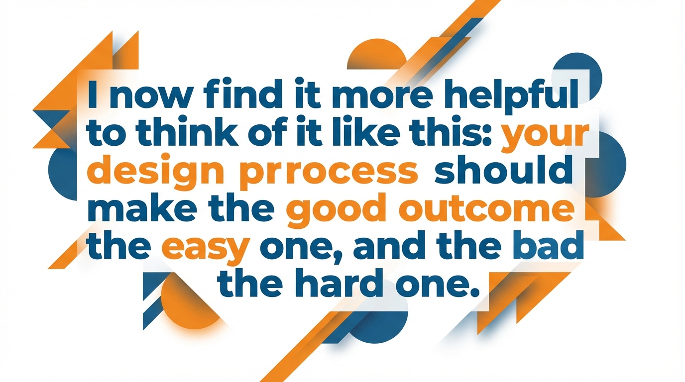
I now find it more helpful to think of it like this: your design process should make the good outcome the easy one, and the bad one the hard one.
So you write first, then reduce copy to find the hierarchy, then plug it into a template that you know has already been battle tested on mobile.
If you ever find yourself wrestling with font sizes and dragging things around for more than a few minutes, your process is too loose.
Lessen the number of templates, and make the text fit a smaller number of boxes: constraint is what makes it feel like a brand.
Consistency becomes almost a certainty when you automate everything that does not require your expertise, but enforces your decisions.
I’ve worked with small teams that were able to move faster when automation took care of mundane branding choices because it eliminated the gradual slide towards wrong colors, misaligned logos, and off-brand language.
For example, a tool like WoopSocial automates the application of your logo, color palette, and brand voice on your social media posts, freeing you up to focus on writing the hook, message, and distribution channel rather than struggling with alignment and formatting each day.
Related reads
4/27/2026
B2B SaaS social media benchmarks: Set the right targets.
B2B SaaS social media benchmarks: Set the right targets. The trouble with defining B2B SaaS social media benchmarks is that it's an inherently impe...
4/25/2026
Building a personal brand as a technical founder (without becoming a creator)
Building a personal brand as a technical founder (without becoming a creator) Creating a personal brand as a tech founder should feel less about ma...
4/20/2026
Creative Post Ideas for Sustainable Brands (That Don’t Sound Greenwashy)
Creative Post Ideas for Sustainable Brands (That Don’t Sound Greenwashy) That’s not what creative post ideas for sustainable brands should look lik...